
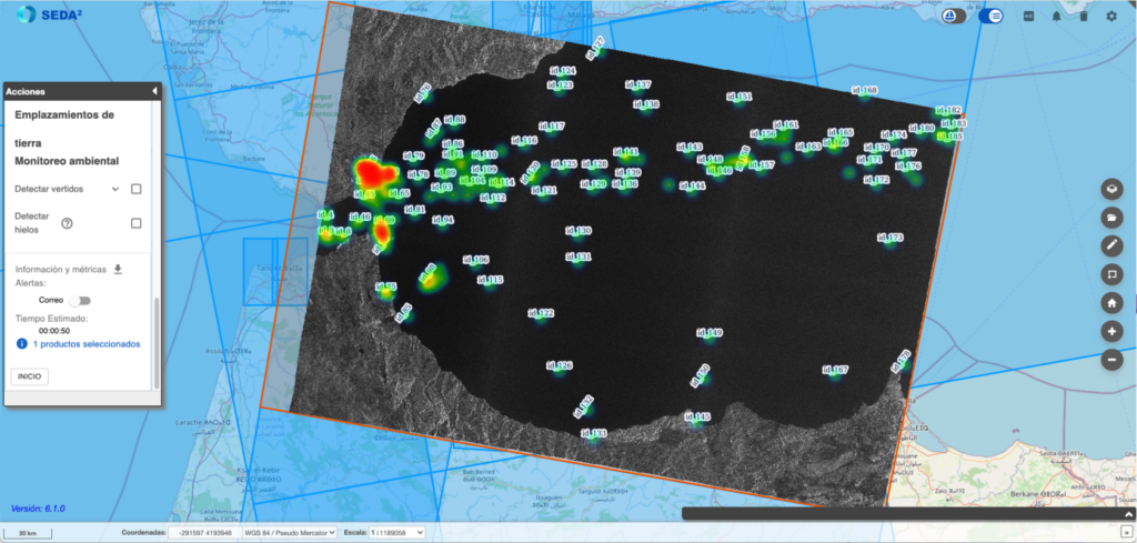
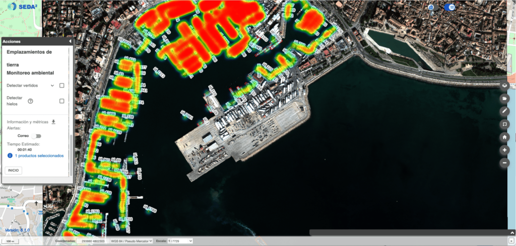
Visualizing maritime traffic through heat maps provides a clear and dynamic perspective on naval activity in strategic areas. This analysis begins with a phase of vessel detection or classification using satellite imagery, identifying types of ships, routes, and movement patterns.
Once identified, heat maps highlight maritime traffic density and routes, allowing for the identification of high-activity areas or potential congestion points. This tool is valuable not only for monitoring and managing traffic but also for tracking possible threats or irregular activities in real or near-real time.
Visualization in SEDA’s GIS
The heat map function is integrated into SEDA’s Geographic Information System (GIS), where users can adjust display filters to analyze specific trends, such as seasonal traffic, recurrent routes, or activities in sensitive areas.
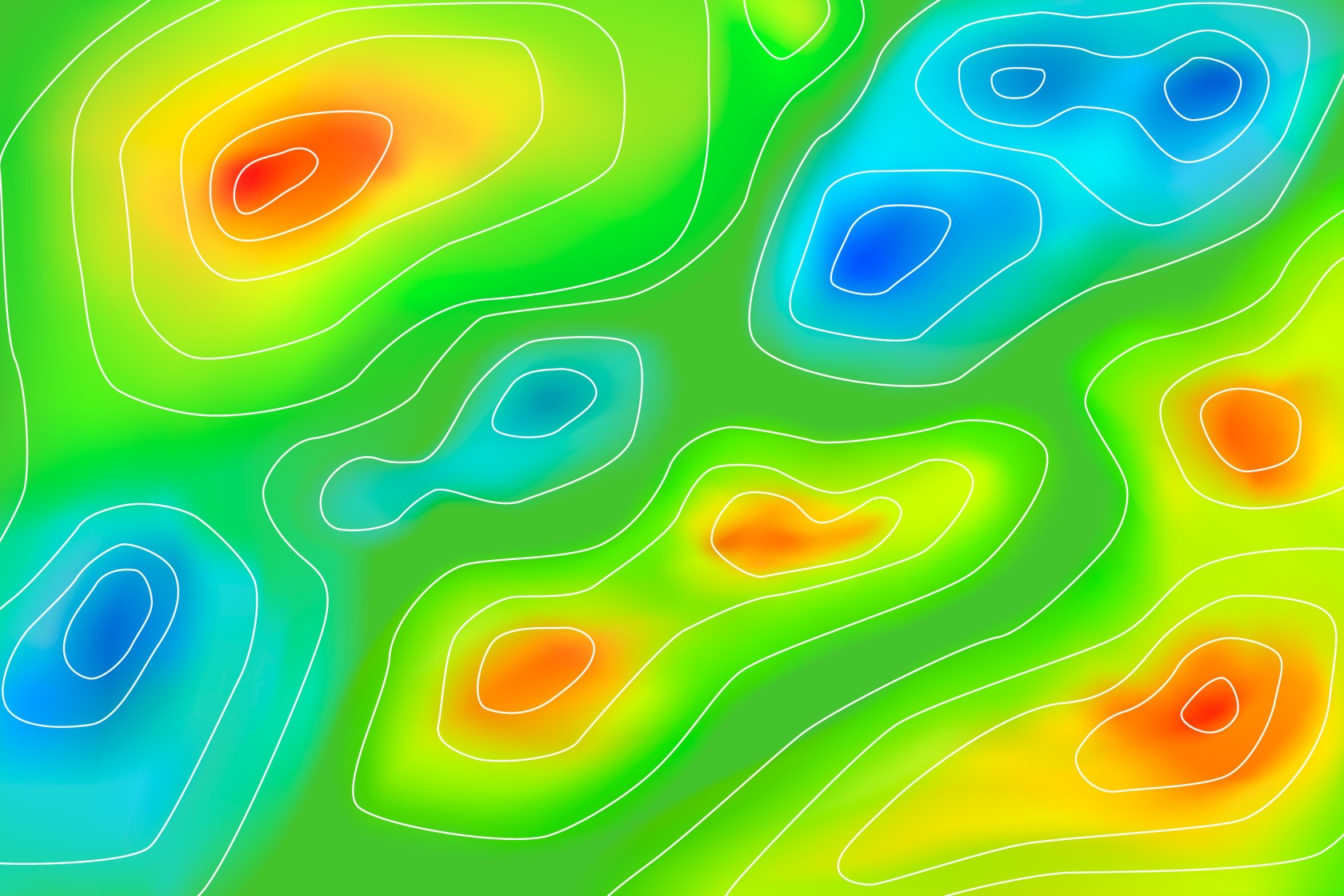
The heat maps represent traffic density using color gradients, with high-density areas highlighted in warm colors like reds and oranges, and low-activity zones in cooler tones. This coding allows for quick interpretation of patterns and critical points, providing a detailed and accessible view for decision-making in defense, port management, and environmental control sectors.
Practical Applications
Heat map visualization of traffic enables the analysis of navigation patterns, supporting strategic planning, route optimization, and the identification of anomalous behaviors. Defense and security authorities, as well as maritime resource management organizations, can use this functionality to anticipate risks, monitor sensitive areas, and assess the environmental impact of maritime traffic.
This kind of clear, concise presentation helps capture interest in heat map functionality within an operational context of maritime analysis and surveillance.